Alta Voice / Brand guide / September 2026
Clear by design.
Dental by nature.
A dedicated voice assistant deserves a clear voice of its own. Room to breathe. Product you can see. Confidence in every detail.
01 / The direction
Make the capability
feel effortless.
Show the work.
Let people inspect the note, follow the chart, and understand the patient view. Product proof carries more weight than a list of promises.
Give it space.
One clear idea at a time. Generous margins, readable captures, and a deliberate pace let the important details stand out.
Keep it human.
Speak to practice owners and hygiene teams in the language of their day. Bring the story back to the people giving and receiving care.
02 / Identity
Always Alta Voice.


Use Alta Voice for the company and platform, including headlines, captions, possessives, and calls to action. Keep the established product names Alta Notes, Alta Voice Perio, and 3D Perio Index.
Keep the logo proportions and lit-bar colors intact. Leave at least one icon-bar width of clear space. Use the full SVG, never a recreated wordmark. The compact mobile navigation uses a 98px lockup; standard navigation uses 125px. Other placements should start at 110px and be checked for readability.
03 / Color
Ink carries the words.
Glacier brings the light.
Ink
Headlines, primary text, navigation, buttons
White
The primary canvas
Glacier
Light, selection, small accents; never text
Mist
Quiet supporting surfaces
Secondary
Body copy and supporting labels
Line
Borders and separators
The voice gradient
135° · #6C8CFF → #2DD4BF
Use on a restrained underline, a button edge, or quiet ambient light. Keep letterforms solid. Preserve original colors inside product captures.
04 / Type & space
Confidence has
room to breathe.
The production system font
Your exam.
Charted by voice.
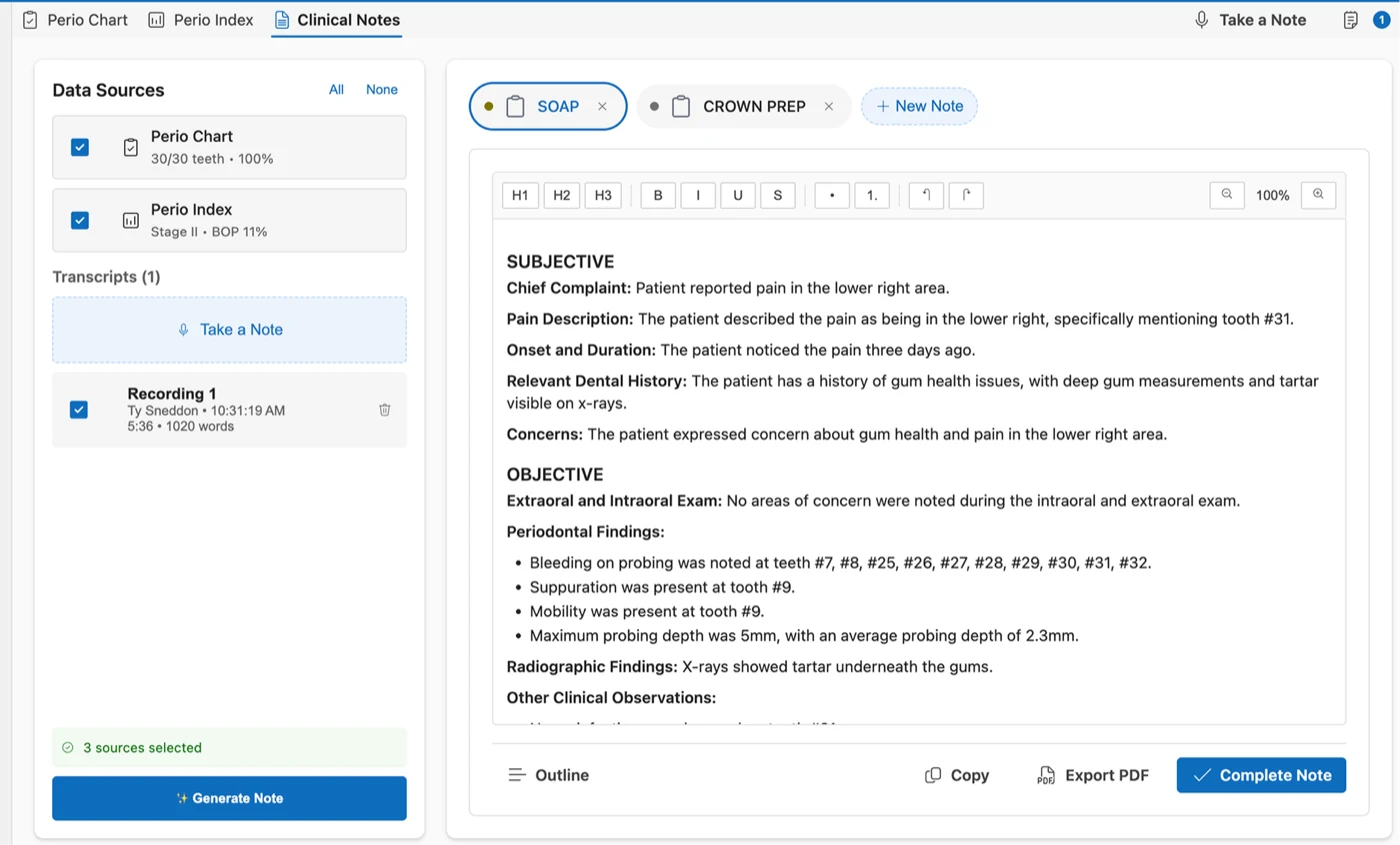
Chart without stopping to type. Call out the measurements, follow the chart as you work, and turn the findings into a clearer conversation with your patient.
| Element | Desktop | Phone / behavior |
|---|---|---|
| Display | 52–82px · weight 450 · tight tracking | 45–53px; fit the actual words |
| Section heading | 37–60px · weight 450 | About 38px, natural line breaks |
| Body | 17px; hero 18px | 15–17px; readers 18–19px |
| Content width | 1184px maximum; navigation 1320px | 20px gutters |
| Section space | 120px; tablet 85px | 68px, adjusted to the content |
| Frames | 11–18px radius, fine borders | Reduce framing before shrinking content |
Font stack: -apple-system, BlinkMacSystemFont, “Segoe UI”, “Inter”, Roboto, Helvetica, Arial, sans-serif. Use the device’s available font; this website does not download a typeface. Sora and Hanken Grotesk belong to the earlier proposal.
05 / Components
Familiar actions.
Considered details.
Primary action
Book a demoInk pill, white words, a moving gradient edge. Hover or focus to see the sweep. Keep the inner surface solid and the next step explicit.
Supporting action
Watch it workA clear play icon and quiet label. Give secondary actions enough space without competing with the main call to action.
| Component | Expected behavior |
|---|---|
| Buttons & links | Visible keyboard focus, descriptive labels, and a 44px touch-target goal. Show loading text during submission; prevent duplicate submissions and restore the action on failure. |
| Product tabs | Selected label and border, semantic tabs, arrow-key navigation, and one visible panel. Pause hidden video. |
| Media dialog | Labeled close control, Escape to close, contained focus, and return focus to the trigger. Pause media on close. |
| Forms & calendar | One details entry wherever possible. Keep labels visible, errors specific, and a direct calendar link available if the embed fails. |
06 / Motion
A little movement.
A clearer moment.
Ambient light specimen
Help the product
hold the room.
Glacier light drifts quietly behind the content. It stays still when your device’s reduced-motion preference is enabled.
One accent.
A 16px dot grid in the hero. A restrained alpine atmosphere. A slow light field around the 3D Perio Index. Keep closing sections quiet; omit waveform divider strips.
A measured pace.
Button edge: 550ms. Arrow shift: 200ms. Ambient light: an 18-second alternating drift, beginning after five seconds and running only in view.
Control stays visible.
Respect reduced motion. Silent product clips play once when visible, pause offscreen, and offer controls. Disable automatic video for data-saving settings. Sound requires intent.
These are the standards for authored site motion. Audit legacy embedded media separately before claiming complete motion-control coverage.
07 / Voice & proof
Specific is
more persuasive.
Speak to their day.
Lead with the job: finish the note, chart the exam, explain the findings. Explain how Alta Voice helps, then show the actual steps. Keep clinical review and the practice’s existing workflow in view.
Finish the note. Get back to care.
PerioYour exam. Charted by voice.
Practice softwareKeep the software you already know.
Let evidence set the claim.
Use real captures and customer quotations with attribution. Show Notes as generate → review → edit → copy. Explain Perio transfer for the actual software and version. Describe prerecorded clips as recordings.
Use the dental-first positioning confidently. Publish a “#1” ranking or quantified outcome only with support for that exact claim. Avoid blanket integration promises, invented testimonials, and fabricated product screens.
“As a hygienist, every minute matters, and Alta Voice gives me more time to focus on what matters most—my patients.”
Photography: bright, candid, clinically credible. Use permissioned human stories. Landscape imagery provides atmosphere. Never present generated imagery as a real customer or combine unrelated chart, model, and report examples as one case.
08 / Page system
One voice.
Across the site.
| Page | The story to tell |
|---|---|
| Home ↗ | Dental focus → product tour → customer proof → Notes → Perio → patient understanding → practice fit → demo. |
| Alta Notes ↗ | Benefit → readable capture → source material → preferred templates → review and copy → practical questions. |
| Alta Voice Perio ↗ | Benefit → recorded exam → workflow → hygienist proof → 3D and report → software transfer. |
| Demo ↗ | A clear agenda and the shortest practical route to one confirmed booking. Keep preparation optional. |
| Blog ↗ / Webinars ↗ | Find a relevant topic, read or watch comfortably, and continue to an appropriate product or demo. |
| Partners ↗ / Contact ↗ | Credible people and a clear next step. Retain partner attribution through the booking journey. |
September website edition: the selected homepage, shared page system, typography, and restrained motion supersede earlier website explorations. The original palette and logo identity remain. Existing print and email work keep their own approved format rules.
09 / Reusable prompt
Carry the direction
into the next page.
A complete brief for a designer, developer, or AI collaborator. It combines the visual system, product story, naming rules, and delivery expectations.
Read the full design prompt
# Alta Voice — website design prompt

Use the approved September 2026 Alta Voice website and its /brand guide as the design reference. Extend this direction consistently; preserve the selected homepage composition and existing product resources.

Design for practice owners and hygiene teams. Make Alta Voice immediately recognizable as a dedicated voice assistant platform for dental practices. Show the work: a chairside conversation becoming a structured clinical note, spoken measurements entering a perio chart, and findings becoming easier to discuss with a patient. Lead with a clear benefit, demonstrate the actual workflow, answer practical questions, then offer a demo.

Always call the company and platform Alta Voice. Keep the established product names Alta Notes, Alta Voice Perio, and 3D Perio Index. Use plain, specific language. Explain customized note formats and the review/edit/copy workflow; describe perio transfer for the relevant practice software and version. Preserve exact customer quotations and attribution. Do not invent rankings, performance numbers, clinical outcomes, integrations, testimonials, or automatic transfers.

Use white #FFFFFF, Ink #0B1020, secondary text #3D4A5C, Mist #F5F7FB, and borders #E2E8F0. Glacier #99FFFF is light and emphasis, never body text. Reserve the 135-degree #6C8CFF to #2DD4BF gradient for restrained underlines, button edges, and ambient light. Keep letterforms solid Ink. Preserve the original colors within product recordings and screenshots.

Use the production system font stack: -apple-system, BlinkMacSystemFont, "Segoe UI", "Inter", Roboto, Helvetica, Arial, sans-serif. Do not introduce a font download. Display weight is 450, with close tracking and natural line breaks. Use fluid desktop H1 sizes around 52–82px, section headings around 37–60px, and body copy around 17px. On phones, adapt display type to 45–53px and body copy to 15–17px. Keep long-form readers comfortably readable at 18–19px.

Work within a 1184px content width, with generous 48px desktop and 20px mobile gutters. Give sections approximately 120px desktop, 85px tablet, and 68px mobile vertical space. Alternate spacious editorial compositions, readable product frames, and human proof. Avoid a repetitive wall of cards. Product frames use restrained borders, soft shadows, and roughly 11–18px corners. Primary calls to action are Ink pills with white text, a 550ms gradient edge sweep, and a subtle arrow shift. Supporting links are quiet and explicit.

Preserve the subtle hero dot grid and quiet alpine atmosphere. Use slow, low-contrast Glacier light around the 3D Perio Index. Keep closing sections calm. Do not add decorative waveform divider strips. Motion should clarify a state or focus attention on the product: no competing loops, scroll hijacking, or moving text. Honor reduced-motion and data-saving preferences. Product clips are silent, play once on visibility, pause offscreen, and offer controls. Sound starts only after a deliberate action.

Use real, readable product captures and permissioned customer material. Label edited recordings and demo data accurately. Never label prerecorded material as live. Do not fabricate software UI or imply separate chart/model/report examples are the same clinical case. Use enlargement for dense captures. Human photography should feel candid, bright, and clinically credible; landscape imagery supplies atmosphere rather than product evidence.

Carry the same typography, spacing, palette, navigation, and footer through Home, Notes, Perio, Demo, Blog, article readers, Partners, profiles, Contact, Webinars, episode readers, legal pages, and Brand. Use semantic headings, keyboard access, visible focus, clear errors, responsive layouts, and stable image dimensions. Treat 44px touch targets and WCAG AA contrast as delivery targets, and verify them rather than claiming compliance from appearance.

For the demo journey, aim for choosing a time, entering details once, and confirming one booking on the page. Do not add a separate lead form without a specific business requirement. Preserve routing, partner attribution, consent, CRM ownership, and confirmation behavior when the chosen booking configuration is implemented. Keep the approved design distinct from unresolved integration decisions.

Deliver responsive implementation and a concise record of changes, validation, and remaining launch dependencies. Keep prior versions available. Premium means clear hierarchy, credible product proof, deliberate spacing, and reliable interactions.
Alta Voice · Clinical Light · Website edition 2026.09
Download the design summary